Information architecture | Our Mayberry
Clarifying what a website can do for users through improved affordances, signifiers, and storytelling
Role
Design lead, Information Architecture second seat. Responsible for sketches, wireframes, prototypes, component library, style guides, and UI kits. Conducted current site map analysis.
Scope
• Organizational research
• Competitive/comparative analyse
• User interviews & affinity map analysis
• Site maps, user flows, & journey maps
• Sketches & lo-fi wireframes
• Clickable prototype of desktop website
• Usability studies & analysis
• Iterative redesigns
Project Duration
3 weeks
Tools
• Figma
• Photoshop
Background
Our Mayberry is defining the future of digital commerce with a platform that connects consumers, businesses, and nonprofits so every transaction includes a charitable contribution. The platform was already live, having recently launched their website and progressive web app, and were growing overall but felt a bit “in the weeds,” There was a lot of confusion from users about how to use the site, especially since not every user would be using every feature. They wanted us to review the user experience of their site and app, both to think about how to simplify the interface and trim it down based on user needs and enable their business to select the right user flows for increased adoption and expansion.
The challenge
Our Mayberry needed to better convey to new users what the site is, what can be done there, and why they want to do it—and they need to do this for three distinct user groups: consumers, businesses, and charities. For the consumer users specifically, the user flow was convoluted already, and would only become more so should the site expand to include more businesses selling more products and services across communities nationwide. This needed to be addressed in anticipation of, and to facilitate, that expansion.
The solution
A redesigned front page that tells a clear story of how these three groups are connected in a virtuous circle that benefits themselves and their community. This page also prioritizes getting consumers to products (via search or browse) in a single click, as well as onboarding businesses and charities. The consumer user flows were then overhauled and streamlined, with better wayfinding and signifiers of affordances throughout.
Research
To launch our work with Our Mayberry the whole team divided up the initial organizational research we wanted to conduct in advance of the first full meeting with our client. It was particularly important to understand the business goals, needs, and pain points of the company; the nature of their competition in the broader business landscape; and the current state of their design—the visual presence as well as the underlying information architecture.
Style guide
I took charge of creating a style guide cataloging the current visual identity of Our Mayberry. This was important to establish early on since we were not tasked with a major redesign of the overall branding and visuals for the website. Instead, our team needed to apply the existing look-and-feel of ourmayberry.com to whatever changes we proposed to the underlying structure, organization, and layout of the site.
Site map
Similarly, before we could even begin to suggest changes we needed to untangle and understand the current structure of the website. I picked apart the existing website, charting a site map so we could articulate to ourselves—and the client!—where the pain points existed in the information architecture itself. Only then could we offer solutions to address the issues in onboarding and user flow that were plaguing Our Mayberry. Building on the site map, my teammate drew up several user flows which helped to illustrate exactly how byzantine the user’s path through Our Mayberry’s site really was.
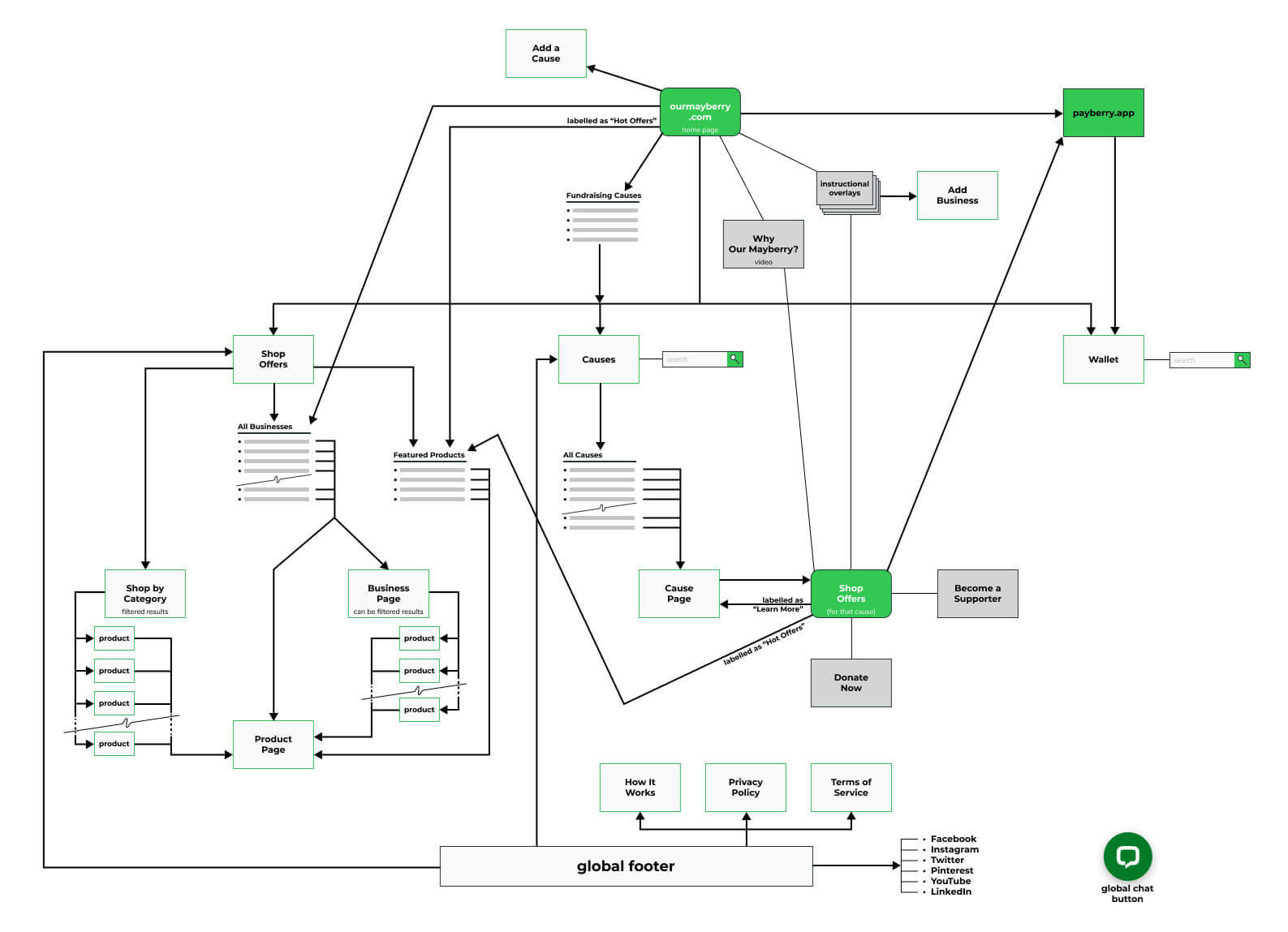
The convoluted state of the site map at ourmayberry.com before we reimagined the website's information architecture
User interviews
My teammates, meanwhile, were preparing and conducting user interviews with a goal of understanding how Belief-Driven Buyers, Our Mayberry’s core audience, were currently operating in the e-commerce space; what sites and services they were employing; and what pain points they experienced that Our Mayberry might be able to alleviate. Once completed and the main ideas and quotes gleaned from each interview transcript had been transferred onto digital sticky notes, our whole team engaged in an affinity mapping exercise on Miro, a digital whiteboarding platform. This exercise helped us to distill the information from the interviews and find the insights, emphases, and associations between disparate pieces of information given by the eight different participants.
Personas
From the resulting clusters of observations and associated collective statements our research lead synthesized two personas to represent two major user groups trying to find their way through the Our Mayberry site as consumers. James is a young, urban, first-time user of the site who is having trouble understanding what can be done with the site, and how to do it. His counterpart is Allison, a middle-aged woman in a town or smaller community, who even as an established user of the site still struggles with the details of its navigation.
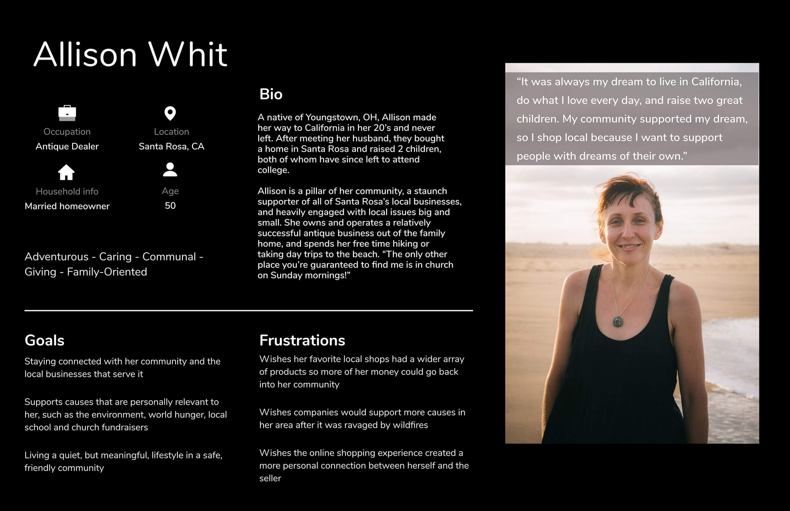
Our first persona, a established user of the site who lives in a small community, still struggles with navigation
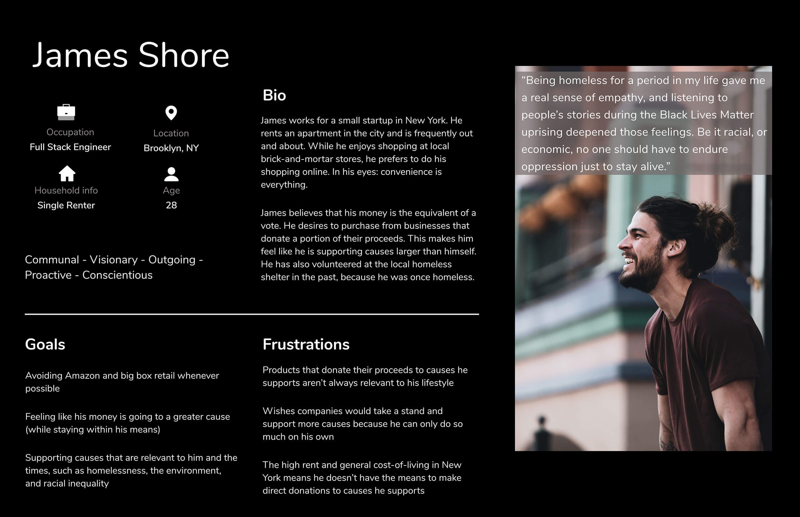
Our second persona, younger, city-dwelling, and mobile-based, is having trouble understanding what the site can do, and how to get it done
Four key problem areas
At this point I proposed to my teammates four key problem areas for us to address in the design and information architecture of Our Mayberry:
1. Our Mayberry landing page
When landing on ourmayberry.com, the paths for each of the three main user types (Consumers, Businesses, Charities) were not clear. We would reimagine the homepage to better serve each of those user groups, while bolstering and clarifying Our Mayberry’s identity, purpose, and usefulness for the new user encountering the site for the first time.
2. My Wallet vs. Payberry
The site had introduced a mobile app called “Payberry.” However, there was a lot of confusion about what Payberry was, how it related to the main site, and how it fit into the consumer’s journey. We would address the presentation and integration of Payberry into the overall purchase-and-redeem flow in order to streamline the handoff from desktop to mobile.
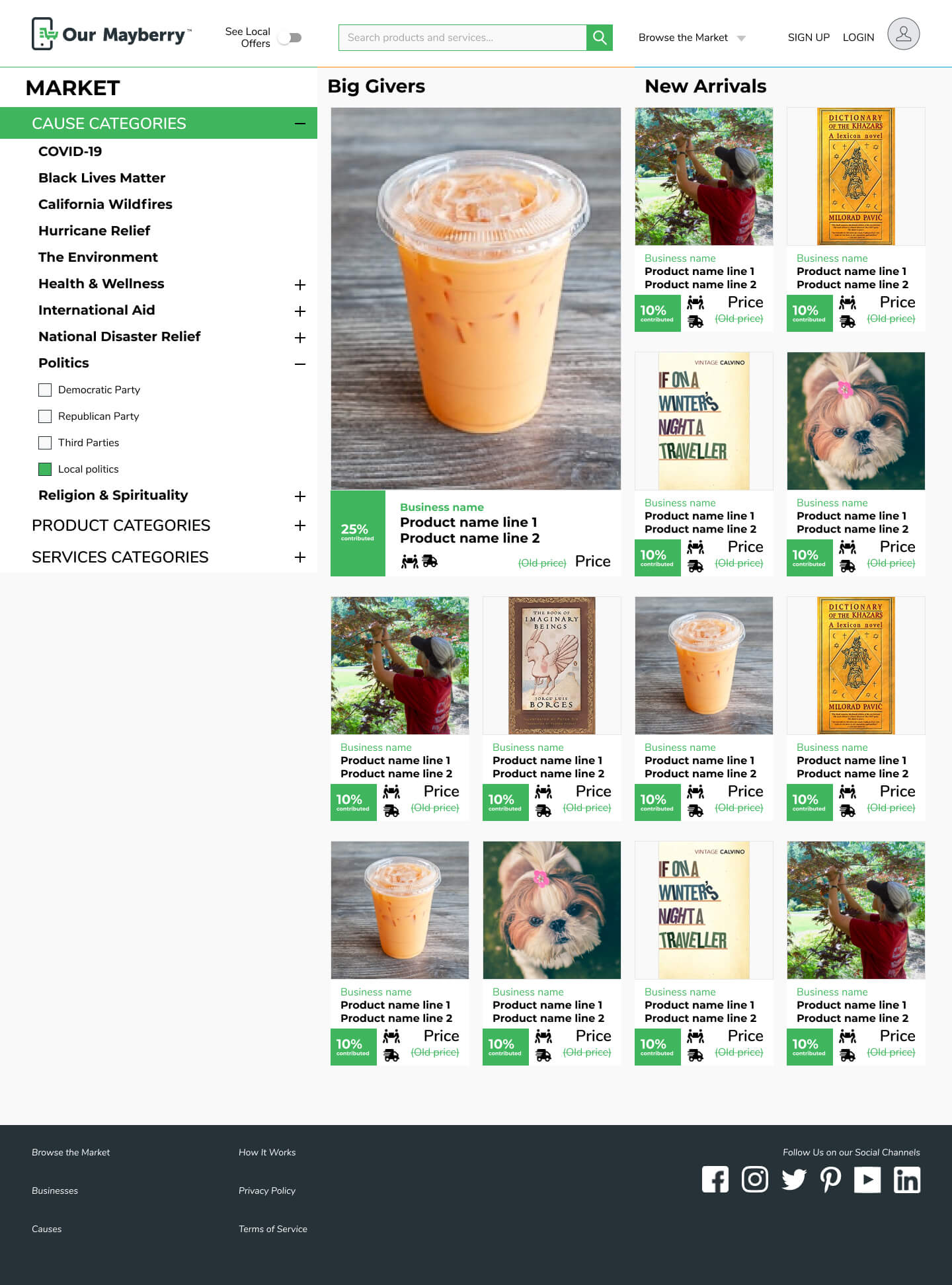
3. Search and filter system
Shopping the main Market was already overwhelming with ~350 items for sale, and would only become more so as more businesses are brought onboard. To facilitate better browsing and finding of products on the website, we would propose a new design for many of the Our Mayberry pages which would integrate a robust search and filter system.
4. Clearer indication of tailored versions of site
It was often difficult to understand if you were seeing the whole website or a filtered version of Our Mayberry which had been tailored to a user’s location, a specific Cause, or both. This problem, if unaddressed, would only become worse with the introduction of an integrated filtering system to the Market area. We would propose visual and textual solutions to this wayfinding problem.
To think about translating these sketches into wireframes and a clickable prototype using Figma, I expanded my initial style guide by conducting a more detailed inventory of the website including UI elements, navigational elements, and a review of the current interaction design. I also inventoried the current products and services for sale on Our Mayberry, and made note of possible tags for each, with an eye to proposing a better categorization system for the redesign, along with directions for future expansion should they decide to implement a fuller backend metadata system.
Sketches
I then moved into the Procreate app on my iPad, and wielded my trusty Apple Pencil to begin sketching out possible design solutions for those key problem areas.
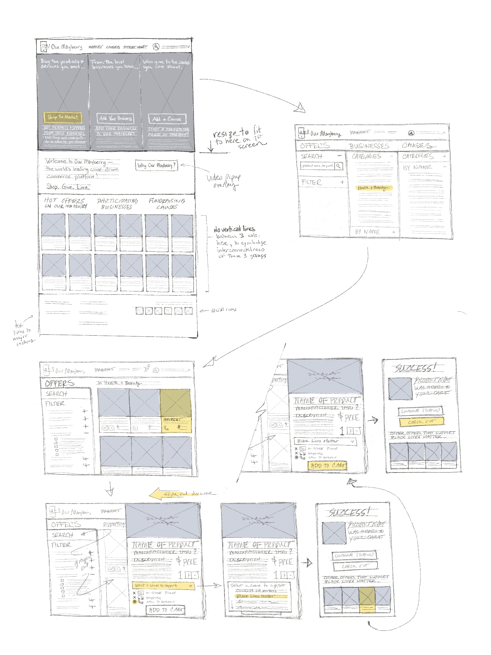
Hand sketches (Procreate app on iPad with Apple Pencil) working out new ideas for the landing page
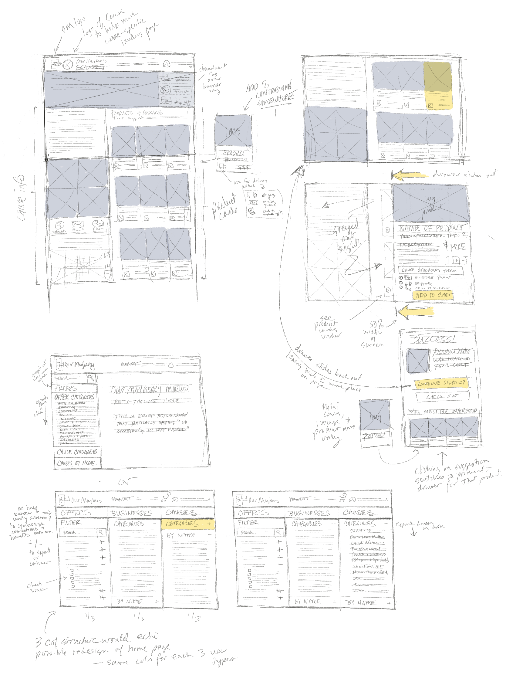
New ideas for a cause-specific landing page (top left), product drawer (right), and filtered search
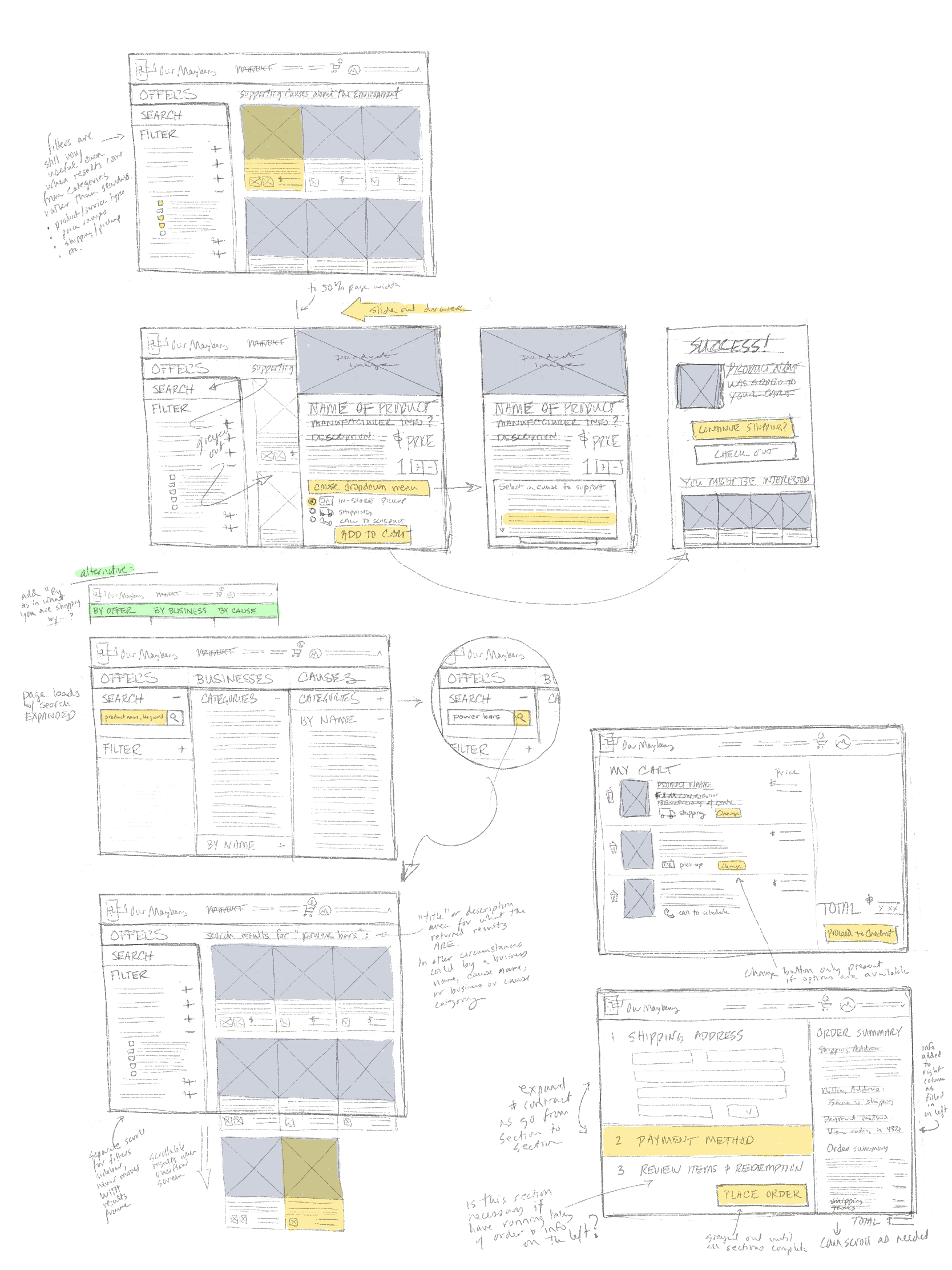
More iterations on displaying filtered results, plus revamped checkout pages (bottom right)
Design, first iteration
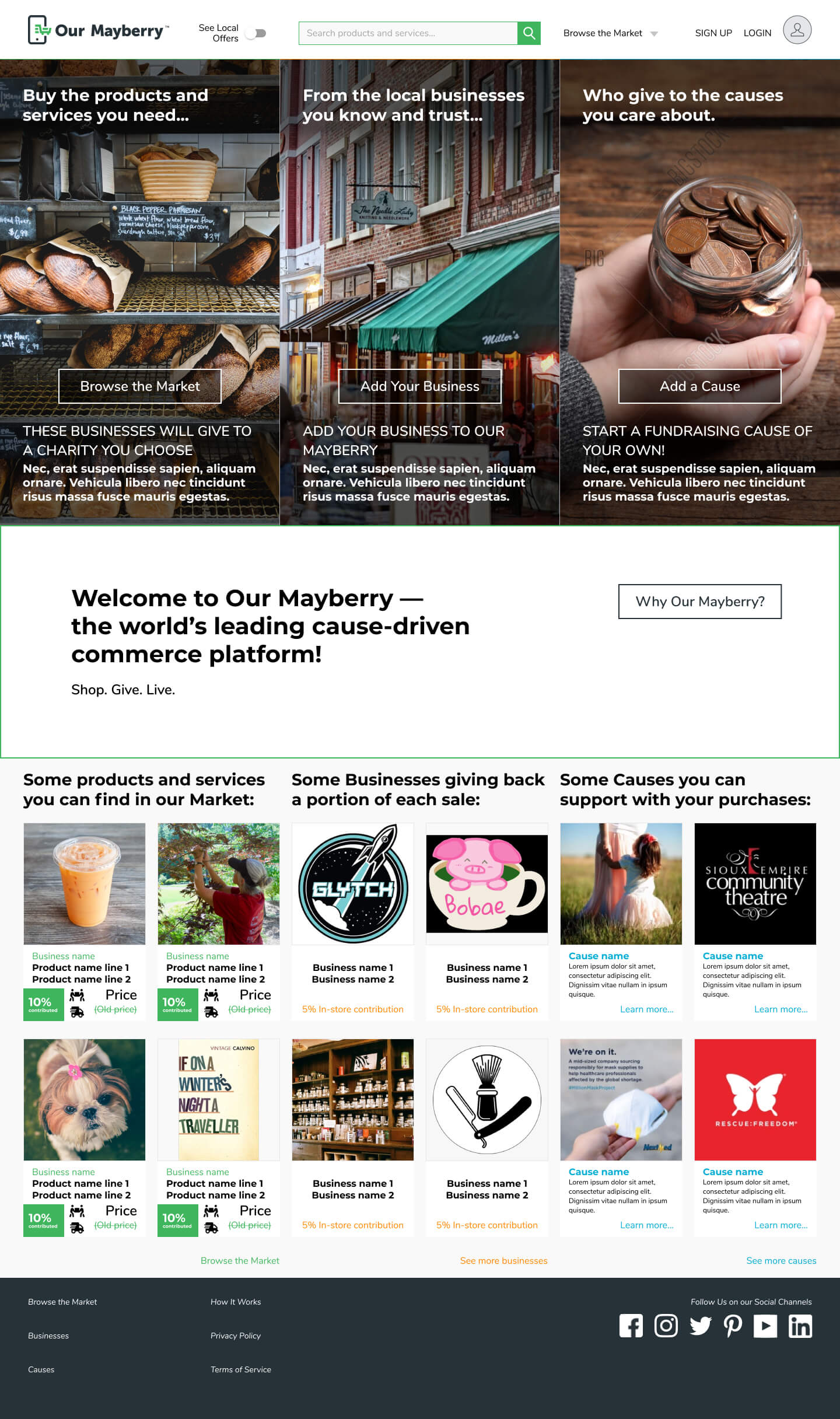
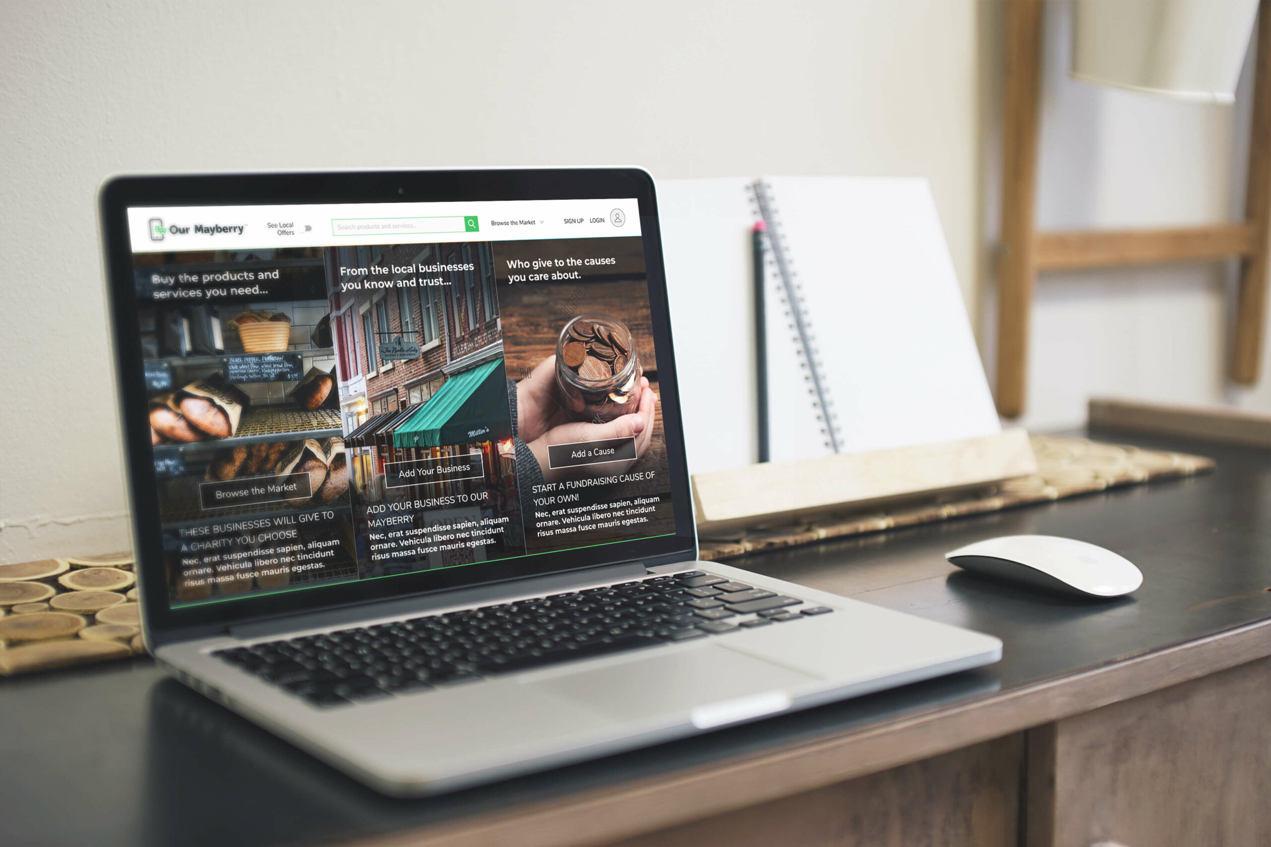
The redesigned main landing page featured a triptych structure that tells the story of how the site's users work together; as well as samples of available products, businesses, and causes, plus faster access to shopping and account creation
As design lead for the project, I organized the design process from pencil sketches and team whiteboard brainstorms through lo-fi wireframes and prototypes. Our goal was to create a new website design with better user flows to increase the onboarding of users, and increased functionality for a future where ourmayberry.com is hosting exponentially more products and services for sale.
To this end I created and maintained a UI kit, style kit, and component library in Figma, and I was solely responsible for creating and editing the clickable prototypes in Figma for usability testing and final presentation. I expanded the existing, sporadic use of additional colors to delineate between the three types of content on the site: consumer-based, business-based, and cause-based. While we were mostly focused on the consumer journey in this redesign, this established color system could be applied to and expanded upon during future expansions of other two areas. I also suggested and actualized interaction design ideas to the team that would address navigational and wayfinding issues with the current site. A particular problem was users losing their place on long-scroll pages of products when switching to product detail pages. I designed a new drawer overlay for product detail pages and the add-to-cart flow which would allow users to keep their place on search result pages should they choose to continue shopping.
I contributed heavily to the redesign of the information architecture for Our Mayberry, to ensure the continuity of users’ conceptual models, perceived architecture, and expected navigation patterns across multiple user flows. Specifically, I was responsible for suggesting and helping to actualize a new triptych structure for page layouts across the entire site, and I completely redesigned the main landing page for the site (including UX writing for buttons, links, and text copy) in order to establish this new layout from the outset. I planned for a new, significantly more advanced search and filter system to be applied to multiple aspects of the site, and designed a consistent layout and interface.
Throughout all of the iterations on the site redesign I kept both a search methodology and a browsing mentality equally available to users, in order to productively serve as wide a variety of user situations and approaches as possible, And I brainstormed ways to apply these new features to best serve local communities, such as by creating Cause categories for browsing which would highlight local charities that a user might not be familiar with, but are a part of a broader cause that user wants to support.
A walk-through of the clickable low fidelity prototype I made in Figma, showcasing the new information architecture, search and filter system, and more
Usability tests
Our team conducted usability studies with six participants in which they completed similar tasks on the existing Our Mayberry website and in the clickable, lo-fi prototype I had made in Figma. Some of our takeaways:
- For most online shoppers, searching specific products or services by name or keyword is their go-to approach and thought process
- Users have been conditioned to not just expect a search bar on front page of site, but instinctively look for it in the header
- The Payberry app was still super-confusing to people even with more explicit explanations at time of purchase and a QR code to bridge the desktop to mobile gap
- In fact, about half of our participants didn’t know what a QR code was or what to do with it
- The fact that Payberry, a progressive web app, is not downloaded from the app store for your mobile device was not only hard for people to understand, but actually made them question its authenticity
New patterns for a pre-search product page allowed for rotating categories of highlighted products, and visual variety in the grid
Post-usability testing iterations
Based on the usability test results I reworked UI elements of the header and footer and renamed global elements (especially link names in the header and footer) to more clearly communicate with users what they can do, and how. For example, we changed the phrasing for the localization option from “Use Location” (use it to do what, exactly?) to “See Local Offers.” These revisions to the UX writing and wayfinding helped create a better conceptual model of the site in the users’ minds.
Search bar in global header
In response to how users used the search and filter system we had introduced in the first iteration I reworked navigation, wayfinding, and user interface elements, most noticeably by adding a product and service search bar to the global header. These changes were made to prioritize search and browse elements, and create a smoother, more intuitive experience while shopping.
Cause-specific pages
I clarified how Cause-specific landing pages were structured and presented visually, and made a clickable prototype and user flow to demonstrate the new design. This included adapting both new and existing features to be better-differentiated within this parallel entry system, visually reinforcing for users that they were on a Cause-specific page. For example, I employed color changes (supported by text) to remind users that searches from these specialized pages were within the subset of products and services that would donate to that particular Cause. I also provided proposals for handling error reporting and error recovery should the returned results be zero, such as asking the user if they want to search within all products and services on the site.
Shopping and checkout
The shopping and checkout experience was tweaked and fleshed out, adding dropdowns for category-specific selections like shoe size and color; and generally providing more visual cues to tasks that must be completed in order to proceed. One repeated pain point for users had to do with understanding the options available to them for getting the goods or services they purchased: have it shipped, pick it up in the store, or—for services especially—call the vendor to schedule it. I made more consistent and repeated use of icons to convey the information about available delivery options earlier in the process, as well as opportunities to change those options later on. We also proposed giving users the option to be reminded of services they signed up for via text or email.
Onboarding and account creation
At the suggestion of the usability testers on my team I added a consumer onboarding and account creation flow to the end of the checkout process. Doing this after they’ve already entered in all the most important information has been shown to increase account creation significantly.
Payberry Wallet
Lastly, I merged the “My Wallet” link on the website and the Payberry mobile app into a single “Payberry Wallet” to indicate to users that they are the same thing. This involved a visual redesign of parts of the logo, as well as overseeing the rewrite of the text for the post-purchase popup to focus on “how to pick up your stuff” instead of pushing the Payberry Wallet app on the user. The new copy provided several options for how they could proceed, only one of which involved scanning the QR code to install the app.
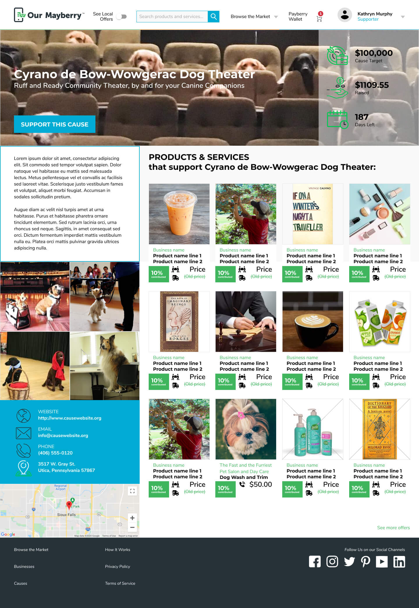
Cause-specfic landing pages were overhauled to make them more visually distinctive and help clarify that searches and checkout would be tailored to products and services supporting that cause
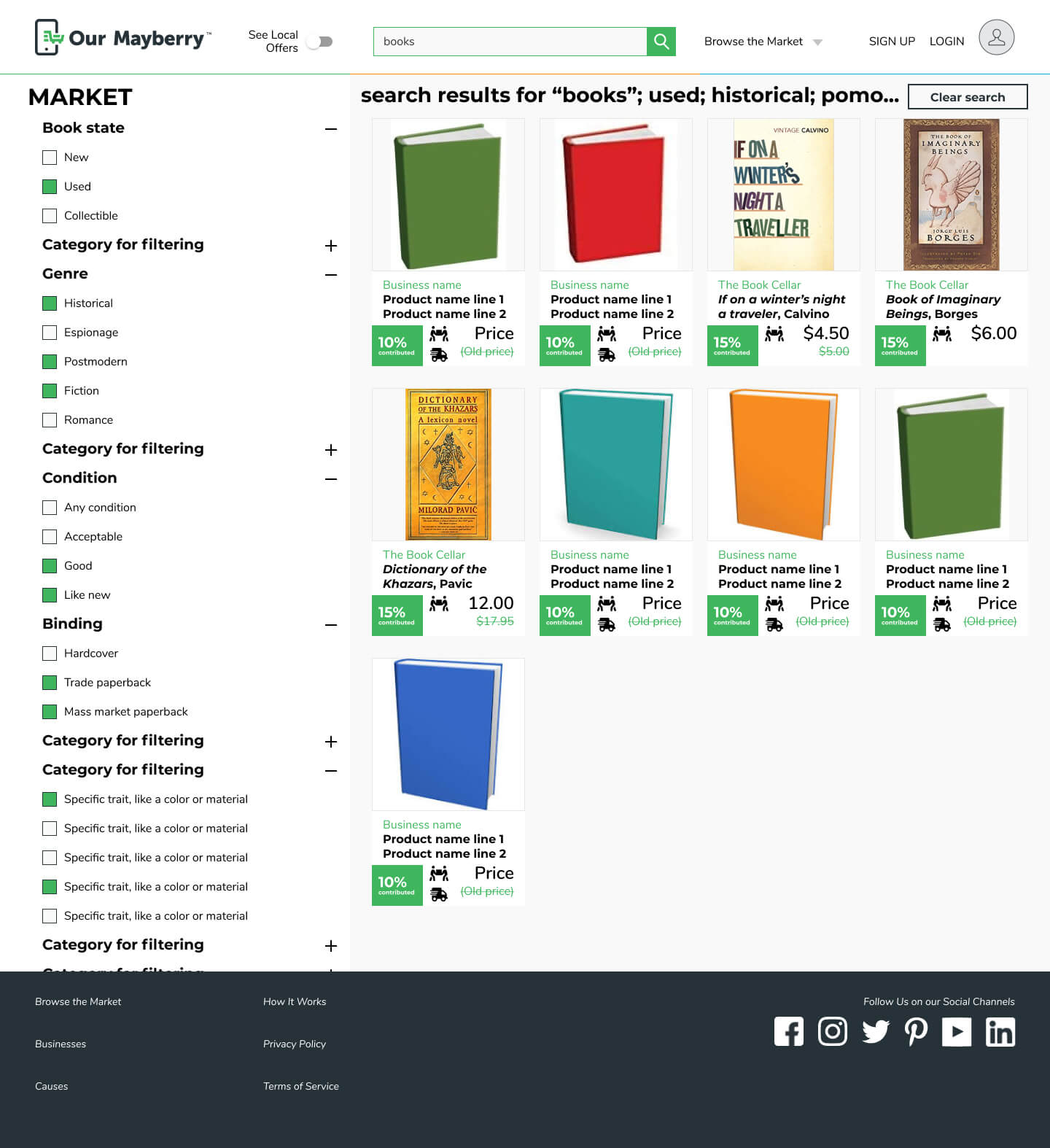
Display of search and filter results was tweaked, and now includes icon depicting of available delivery methods for products
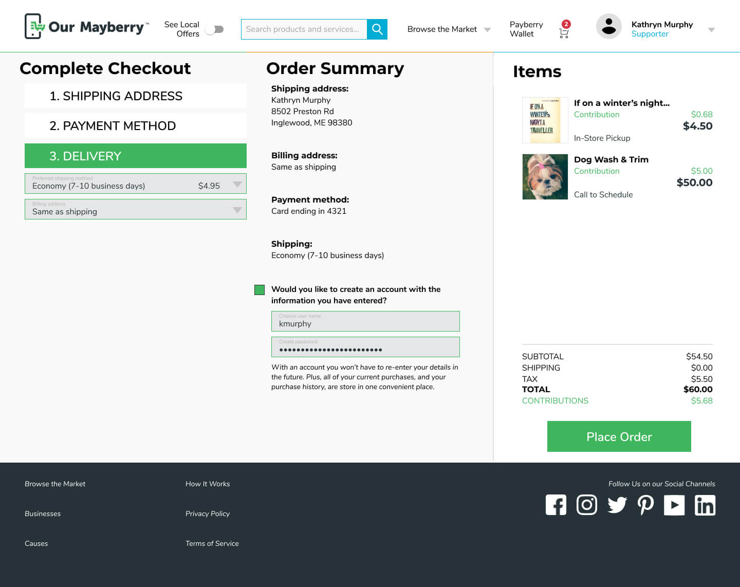
Checkout now includes a last minute option to create an account using the infomation already entered
Conclusion & next steps
Our time frame with this client did not allow for additional usability testing and iterations, sadly, but we could already see several paths for further expansion and exploration in the future.
This sprint was largely focused on the consumer experience, but we laid the groundwork for creating Business-specific landing pages, as well as a backend portal for business owners and charities to administer their respective shops and causes. Additionally, adding some landing page info about the nonprofits and charities behind the Causes could help demonstrate legitimacy.
If the site is able to expand as hoped and bring more businesses onboard, Our Mayberry will need to determine the ideal categories by which to organize the variety of products and services. We suggest conducting a card sort exercise in the future using a healthy sampling of what is being offered on the site.
The user flow for in-store shopping and pickup still needs refining, particularly with regards to the use of the Payberry Wallet app. Additionally, we wondered whether Our Mayberry should consider developing a more shopping-centric mobile experience, instead of leaning heavily on desktop for purchasing and using mobile primarily for pickup.
Reflections on project
This was a brilliant design project to undertake specifically because it did not focus on surface-level elements. The site had launched within the last 6 months, and while there are always aesthetic elements one can fuss over, those were not what we were being asked to evaluate. The problems facing Our Mayberry were fundamentally about information architecture, with some interaction and navigation/wayfinding thrown in for good measure. I love wrestling with those kinds of design issues because I think those are really the heart of design.
The solutions we proposed were about the reorganization of information to better tell a story about the Our Mayberry ecosystem, how a user might find a place within it, and the value that being there could bring to them and—more importantly—their community. We suggested backend systems of metadata whose taxonomies would do a better job of connecting consumers to the businesses and causes they are looking for. And while we were not able to address all of the problems present, we left the client with a lot of actionable solutions plus ideas about future areas of improvement.