Design thinking | Hamlet
Refreshing a work for 21st century consumption, from research through production and launch
Role
- Set designer
Scope
- Visual research
- Sketches
- White models
- Iterative redesigns
- Drafting
- Painter's elevations
Project Duration
- 7 months
Tools
- Vectorworks
- Photoshop
- Hand drawings (Apple Pencil & iPad)
Overview of design thinking
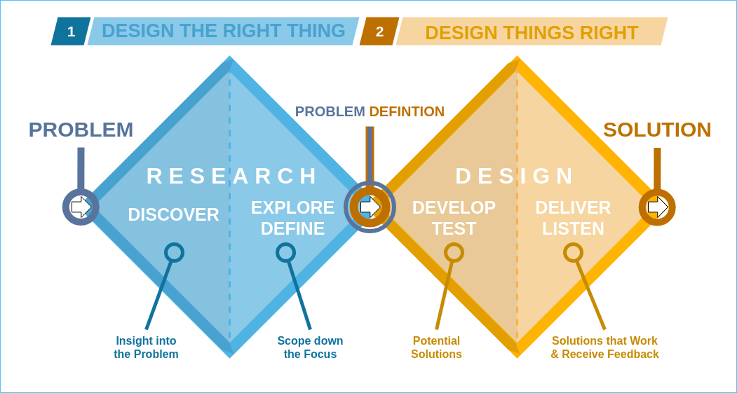
For this case study I will look at one of my designs through the lens of the traditional “double diamond” model with its “Four D’s” of design. I recognize that there are dozens of different tweaks and takes on what “design thinking” is, beyond how the British Design Council or Stanford D School chose to articulate the processes. But this one is very present in the UX community, and clearly articulates the core design principles of research and discovery, iteration, prototyping. and testing. It also importantly structures the individual values of both divergent and convergent thinking in the design process.
Discover
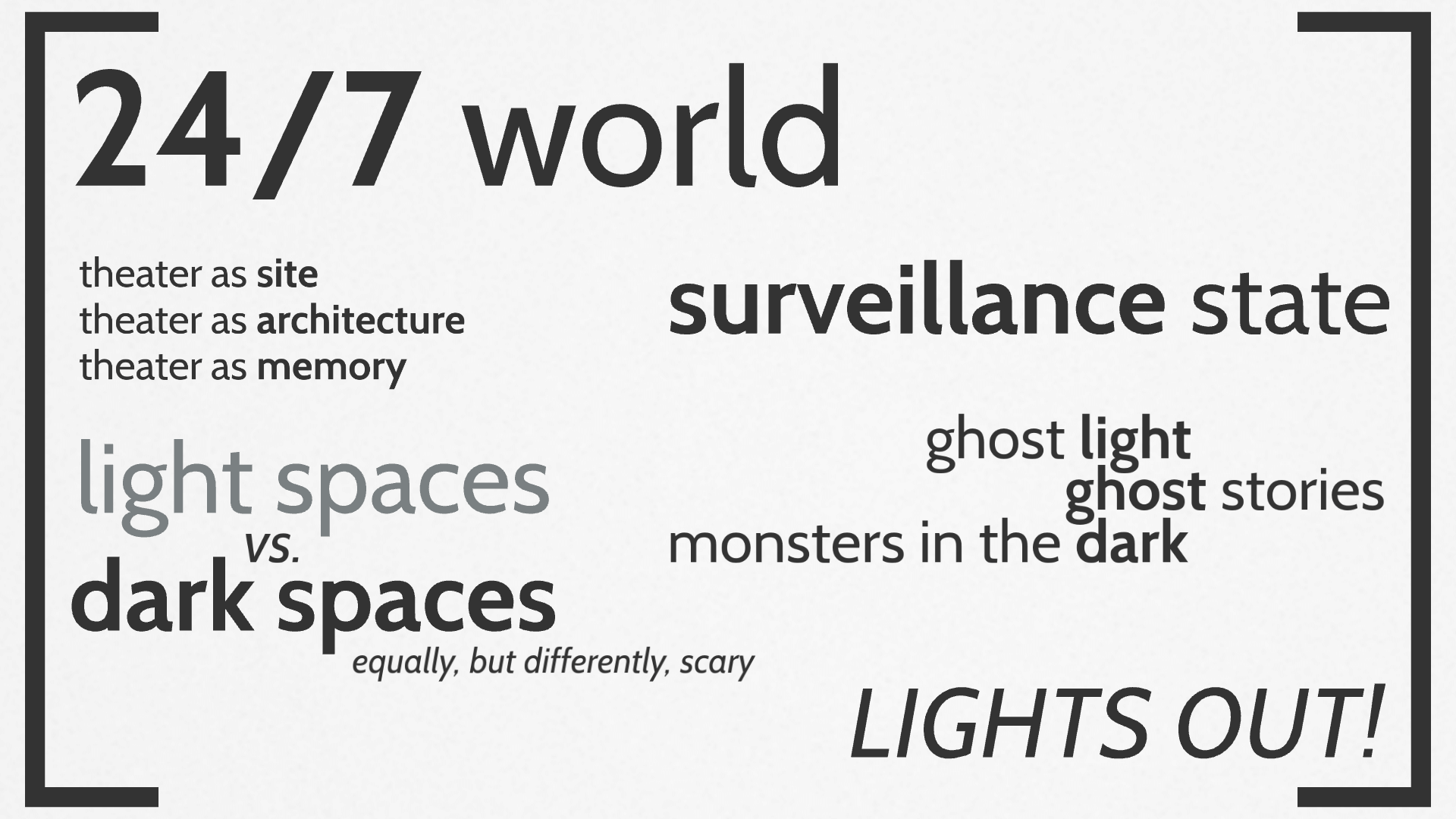
The design process began with the core creative team talking generally about Hamlet, what interested us about the play generally, what problems we might have with it, and most importantly: Why tell the story of Hamlet now, in 2014? We compiled a list of ideas and themes from our group discussion that we each took away to work on further individually.
Possibly I was watching too much The Walking Dead and vampire movies at the time, but I became obsessed with the ghost of Hamlet’s father and the idea that this was a world where monsters lived in the dark. I imagined Denmark as a place that is scared of the dark, scared of the thing under the bed or in the closet; scared of that which they cannot see. Their fear of the darkness has sent them much too far in the opposite direction, where they’ve created a nation-state that is lit up all the time; where there is nowhere to hide, and everyone is observed constantly.
They have traded privacy for security—or the perception of security, because of course the world must come to a point of crisis. If the world depends upon constant light and visibility, there must come a point when the power gets cut to the state of Denmark, darkness descends, and everyone has to deal with their fears.
This vision for Denmark allowed the play Hamlet to be a catalyst for thinking about a very common, and very human, flaw: when we act from a place of fear we often create our own nightmare that's as bad as the thing we ran away from to begin with. Total darkness and total light are shown to be equally terrifying.
Define
In my work as a set designer for live performances I would typically start doing my visual research as part of the initial, divergent-thinking Discovery phase, culminating with all of the designers sharing their first rounds of visual research with each other for feedback and inspiration.
The Define phase was an exploratory process that ultimately focused our approach to how we would collectively solve the “problem” of the play. This iterative period in the design was built around cycles of conducting visual research followed by feedback and discussion with the other designers and stakeholders.
Moving into and through the Define phase with our production of Hamlet I had two main ideas that I wanted to explore:
Brightly-lit spaces
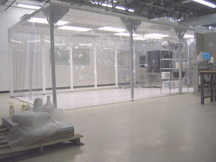
My research looked at a lot of “clean rooms,” which are rooms with controlled environments where they can suck out all the dust and contaminants. They are used for manufacturing microchips computer chips but also there are versions that are used in medicine and with quarantine. I looked both at permanent and portable clean rooms, and ended up using elements of both.
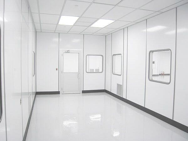
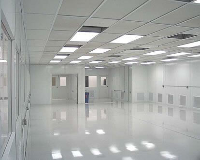
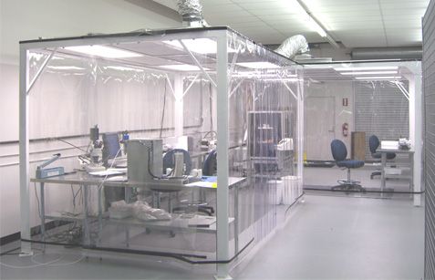
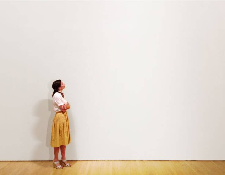
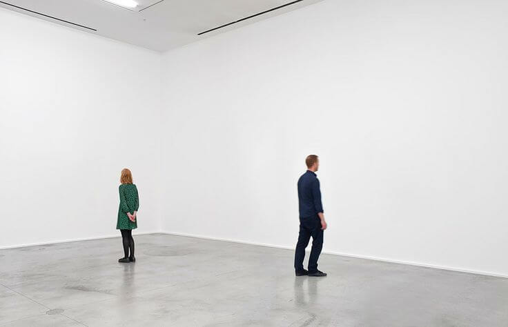
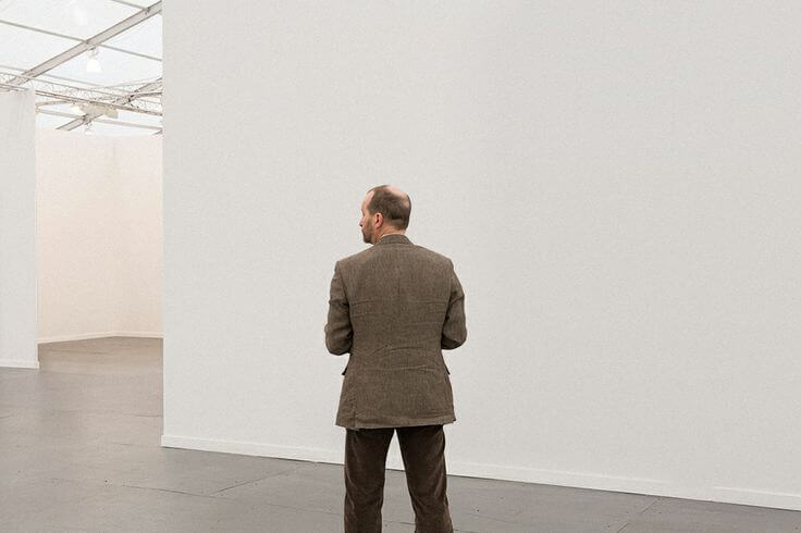
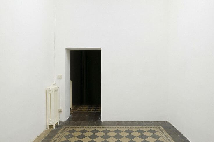
Also I stumbled onto a photo series by Paul Kremer who took pictures of people in a museum looking at art and then used Photoshop to scrub the art from the images, leaving people looking at blank walls. I really liked the strangeness of these poses and interactions, and I thought this might be how it would feel to be with other people in a world where everyone is performing for the unseen watchers.
The last image was from that same series, but it interested me because the floor was so different: this clean white modernism put on top of a dusty, old, imperfect floor. This felt like old Denmark versus new—maybe Denmark under Hamlet Sr. looked more like that floor, while Denmark under Claudius is this pristine white space.
Darkness
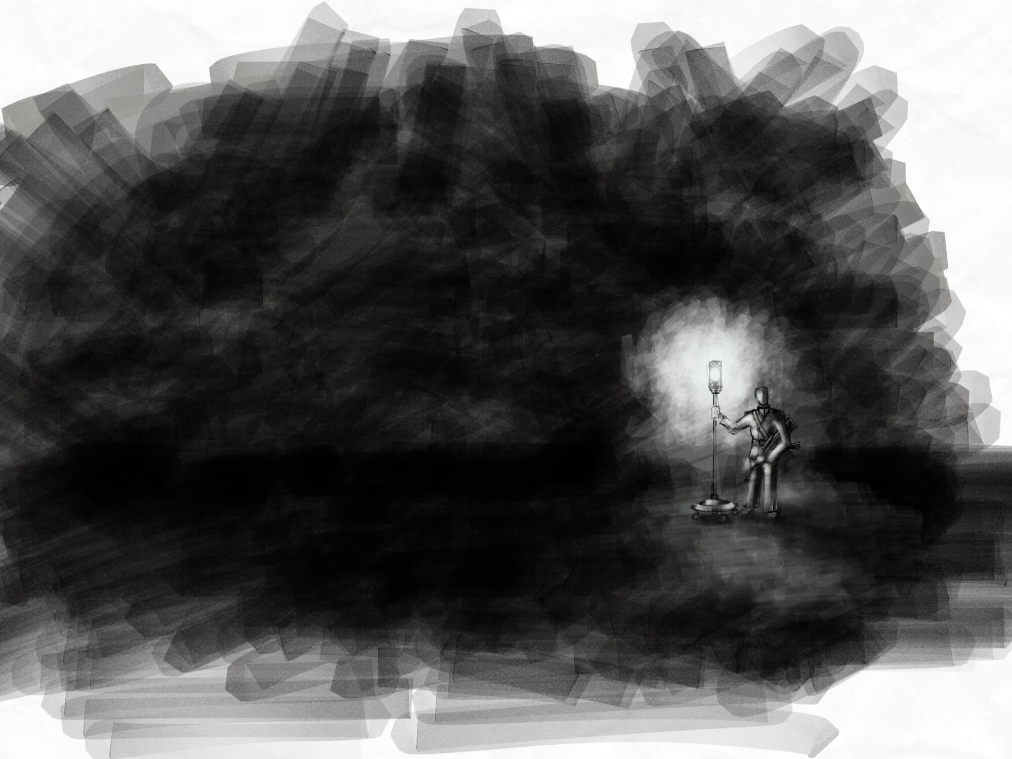
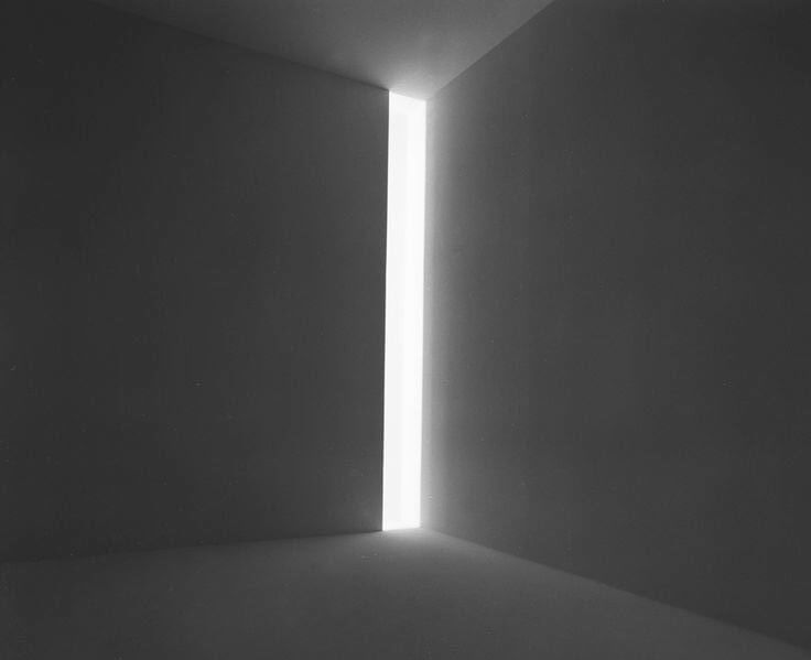
In the first image it’s interesting how dark that space feels because of the presence of this sliver of blinding light. The more research I did the more I realized that depictions of darkness seemed much more resonant when they had little pockets of light for contrast.
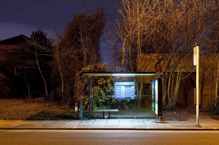
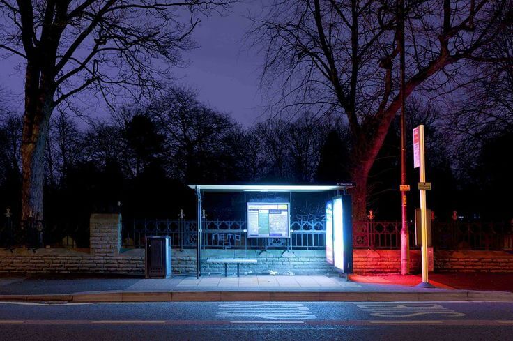
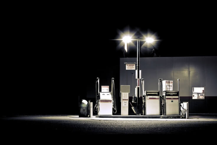
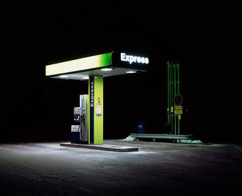
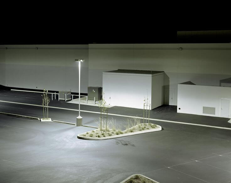
I looked at a lot of photos of bus stops at night, with fluorescent lights encased in plexiglass. Having that box of light is supposed to make you feel safe at night, except in a weird way it make you more aware of how dark it is around you, Gas stations at night do the same thing: it’s so bright around the pumps that it blinds your eyes to what's happening in the darkness. That seemed interesting as a metaphor, too: if you're so obsessed with light you can actually make the darkness worse because your eyes can't adjust to it.
The last image in this set really felt like the whole world of the play: these blocky white monolithic structures lit up by giant industrial lights and surrounded in darkness.
Develop
Sketching out ideas
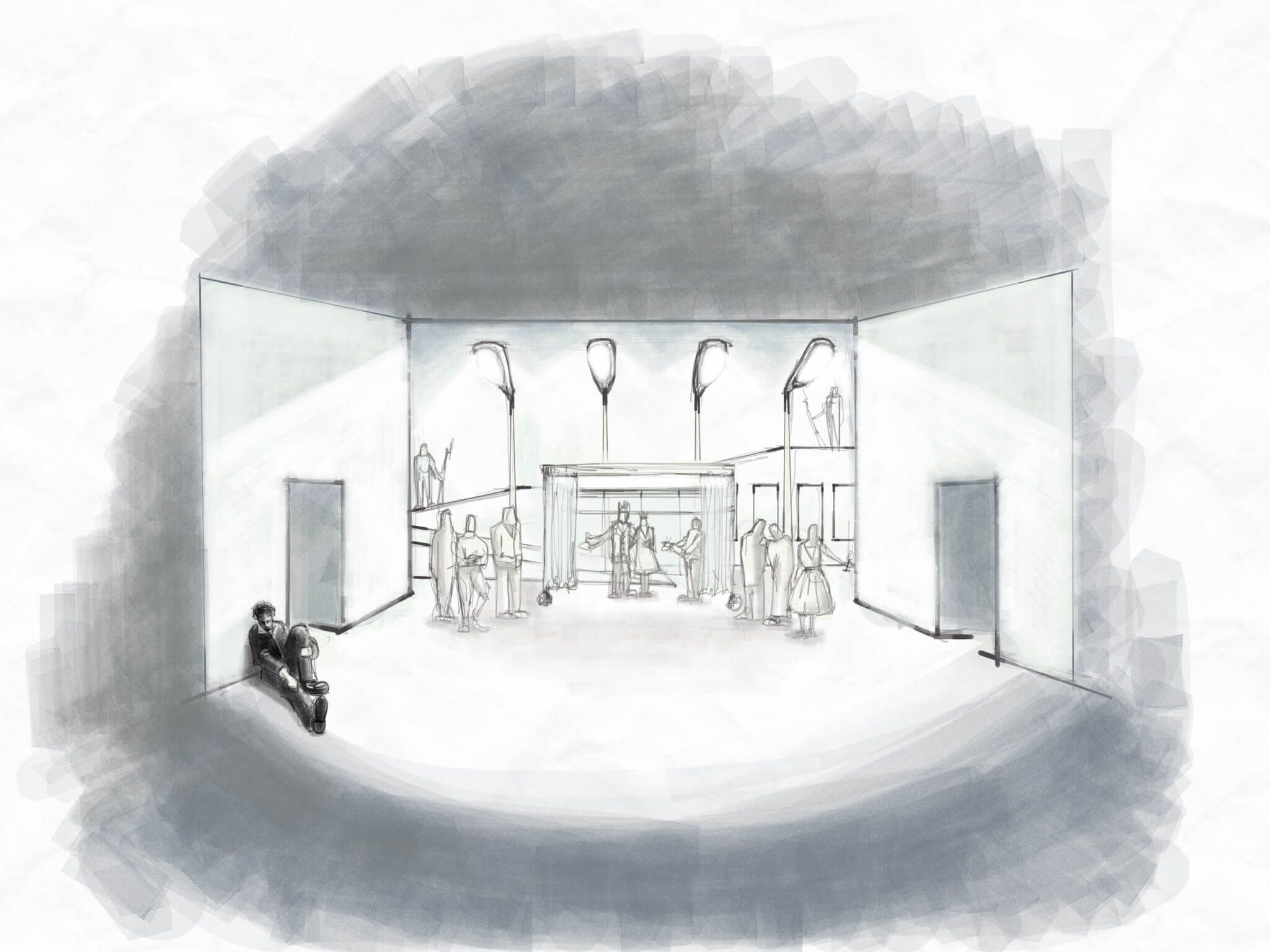
In the sketching phase I began developing how the visual research could manifest in the actual design. For example, I imagined a huge switchback ramp that could be used to evoke the walls of the castle. The blocky forms of this structure, along with its giant parking lot-style lamps, were inspired by some of the parking lot architecture in my darkness research.
The nighttime bus stops turned into mobile guard stations whose fluorescent lighting and bulletproof glass create a safe pool of light—complete with a little bench to sit on.
The throne room replaces the traditional carpeted dais and damask curtains with a portable clean room of heavy plastic so if there were suddenly an outbreak of some disease you could just zip them up and the king and queen would be safe. (Just to note: this was 6 years before COVID-19.)
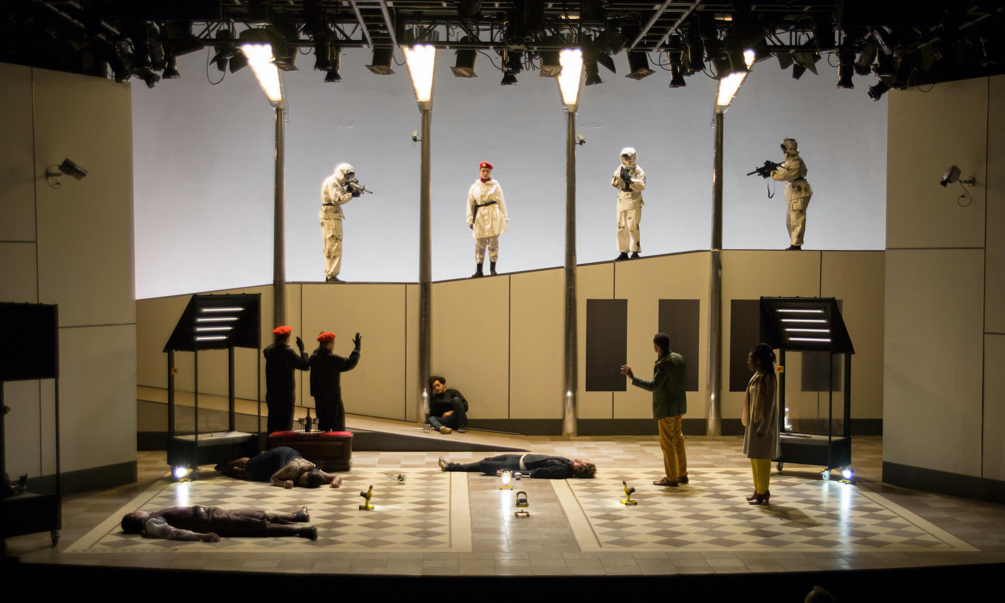
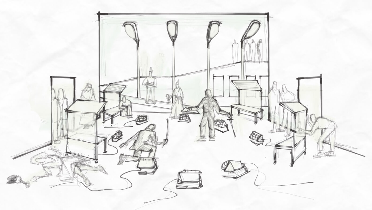
For the final scene, with the duel and [spoilers] everyone dead on the floor, I designed a very frenetic space where things are falling apart: everything has come on stage but nothing is in its regular position. Objects have been hastily arranged to create a circle for the duel, accented by portable work lights shining up from below. (Again, a very counterproductive use of light, blinding the dualists when it's meant to be illuminating them.)
Testing and iterative development
The construction process happened in parallel with the actors’ rehearsal period, so we prioritized building set pieces that the actors interacted with directly. Rough prototypes or the unfinished frames of the real items would be built quickly so the actors could work with the scenery immediately. This way they could both build its usage into their performance more naturally, and give feedback on its usability or make suggestions for changes before the construction was completed.
The ramp was such a large element it was important to have it built and installed right away, even just as a raw plywood structure. This allowed the performers to get accustomed to climbing up and moving down its incline, while allowing the director and I to evaluate stage compositions where one actor might be 8’ above or below their scene partner.
While I had initial ideas for the arrangement of each scene to create different places and locations, during rehearsal the actors discovered many additional ways of using the space. This led to a lovely, ongoing back-and-forth amongst the designers, actors, and director of Hamlet. The details of the scenic design were ultimately developed iteratively, through testing and exploration, over the entire rehearsal process,
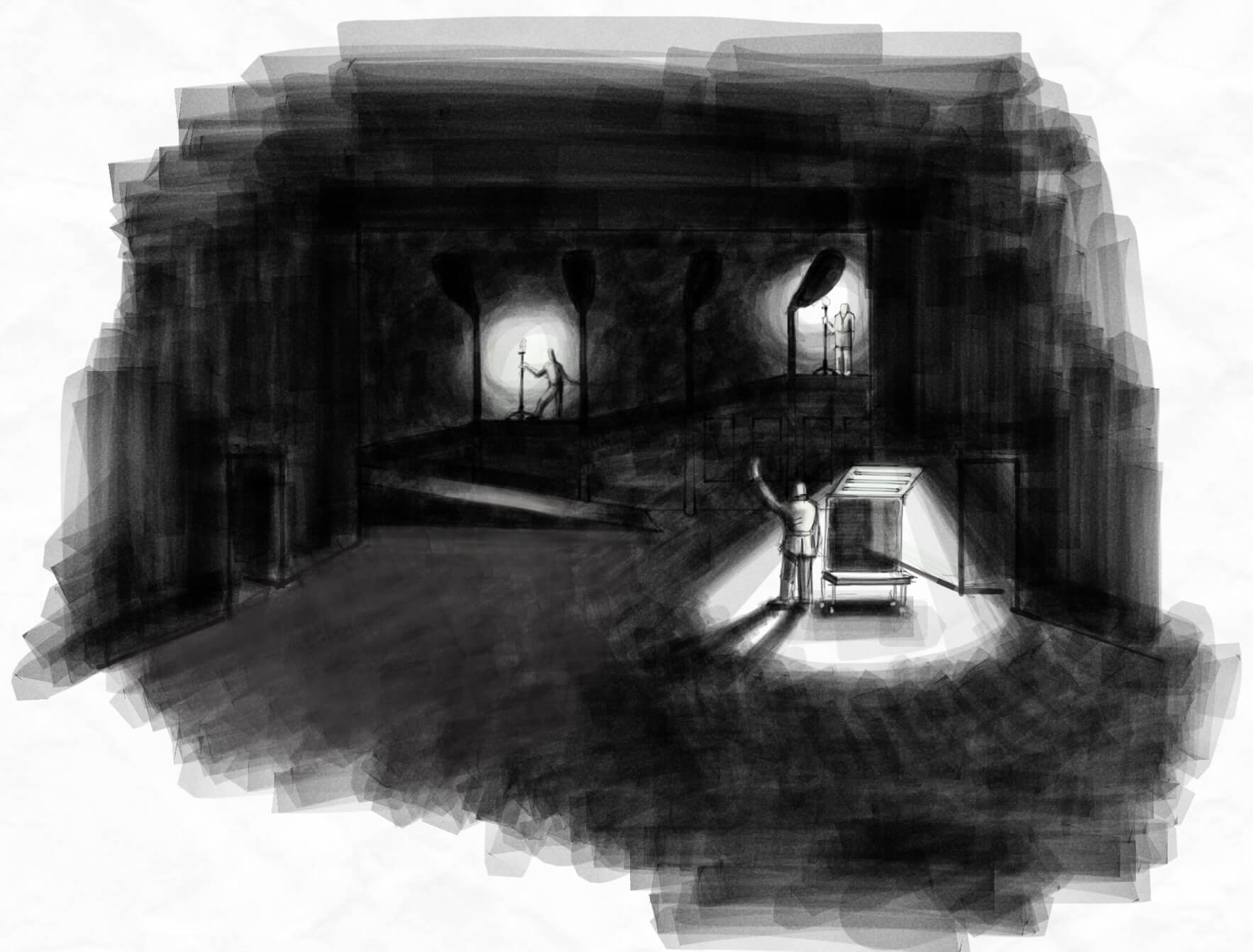
I wanted to end Hamlet’s pivotal play-within-a-play scene by shutting off the lights in the state of Denmark, as if Hamlet’s revolutionary collaborators had bombed the state power plant, plunging the country into darkness for the first time in years. Of course, this idea created a very practical problem: we didn't actually want to spend the next two acts of the play in darkness as that would be incredibly boring.
The iterative design process again led us to a perfect solution. The lighting designer had the idea that shortly after the main power was cut, the “emergency system” would come on. This gave her the opportunity to paint the stage with a more colorful palette, utilizing shafts of light and a lot of shadows on the face, after nearly three acts of creating a blinding white, shadowless fluorescent world,
Deliver
Technical documents
Up until this point my process has largely been me as an artist talking and collaborating with other artists; but now it has to actually get built. For that I shift my mindset, and begin to resemble an architect in many ways.
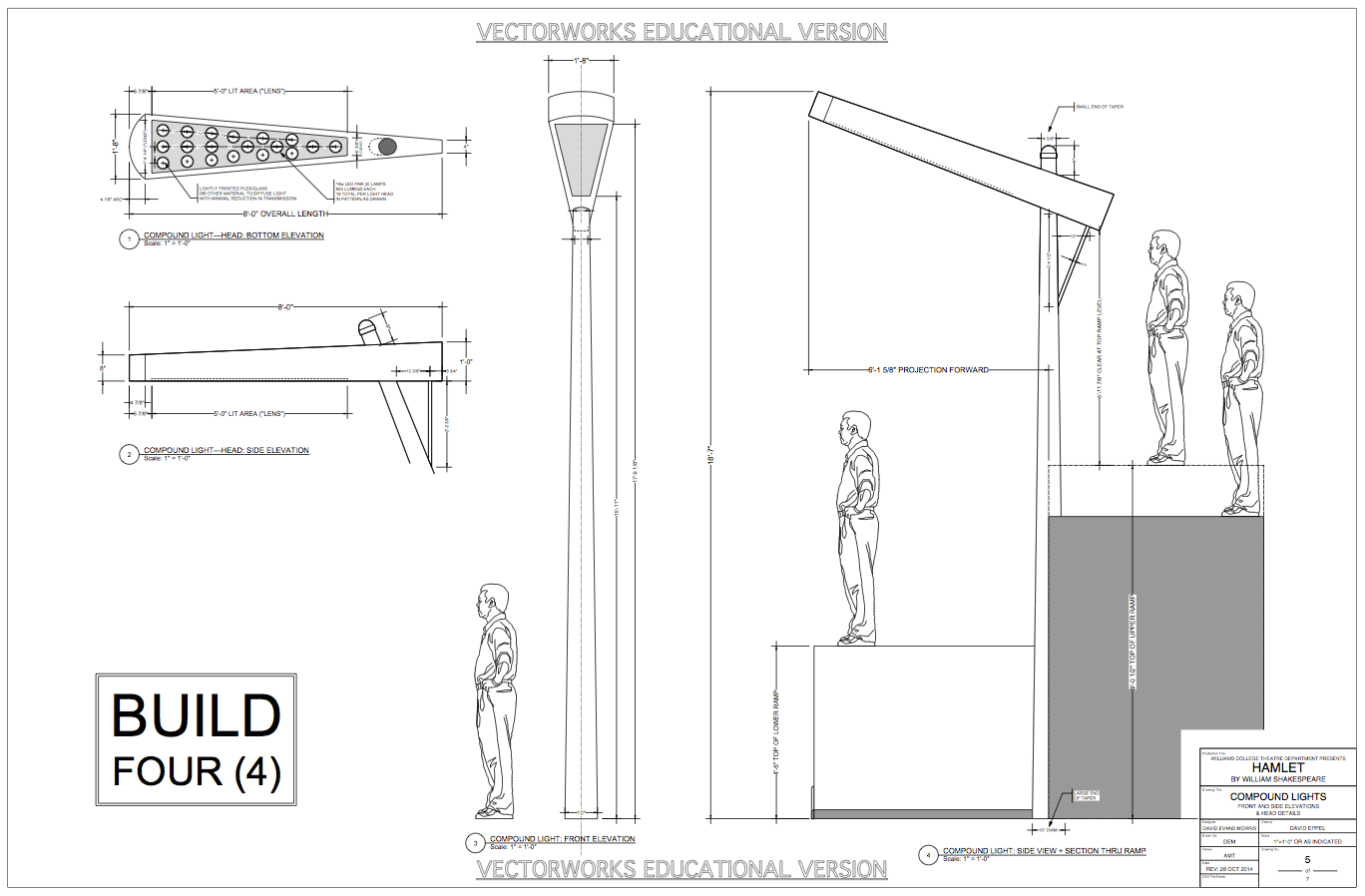
The initial design delivery takes the form of scaled drafting of every element of the scenery: from overall ground plans, sections, and elevations of the entire stage, down to minute drawings for each piece of scenery I am asking the scene shop to construct. The drafting packet goes to the Technical Director, who runs the scene shop; she looks at what I’ve drawn and how I want it to look and figures out how to make it not fall down, stay within budget, and get it built and installed within the amount of time given to the production.
This design presented some special technical challenges, as most of the scenery had actor-operated lighting attached to it. The technical director worked with me to adapt my original designs for the smaller units so they could contain small car batteries that would power their lights. This meant the units wouldn’t trail power cables behind them, making it much easier for both actors and stage hands!
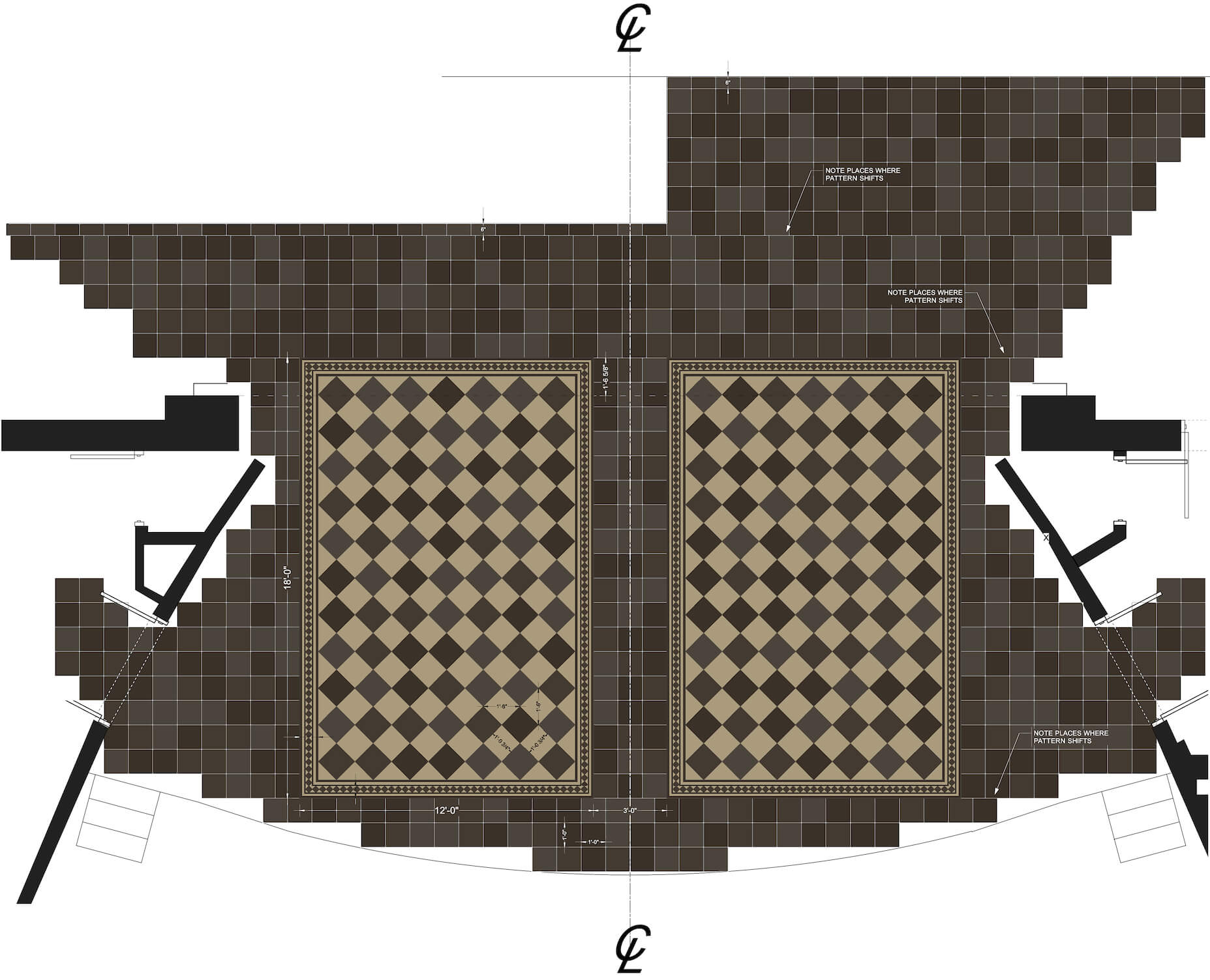
I did a similar thing for anything whose paint treatment is more elaborate than “paint this white and that over there, make it blue.” Here you can see the rendering I produced of what I wanted the stage floor to look like. You can see how this design came very directly from the visual research, with the pattern and color palette being adapted to the stage area of the set design.
Final deliverables: production photos
From the moment you entered the theater you saw large monitors mounted on the walls, and cameras everywhere—some pointed to the stage some pointed at the seats. Live feeds of the audience as they entered were displayed on the monitors, creating this sense of entering a surveillance state that would continue throughout the show.
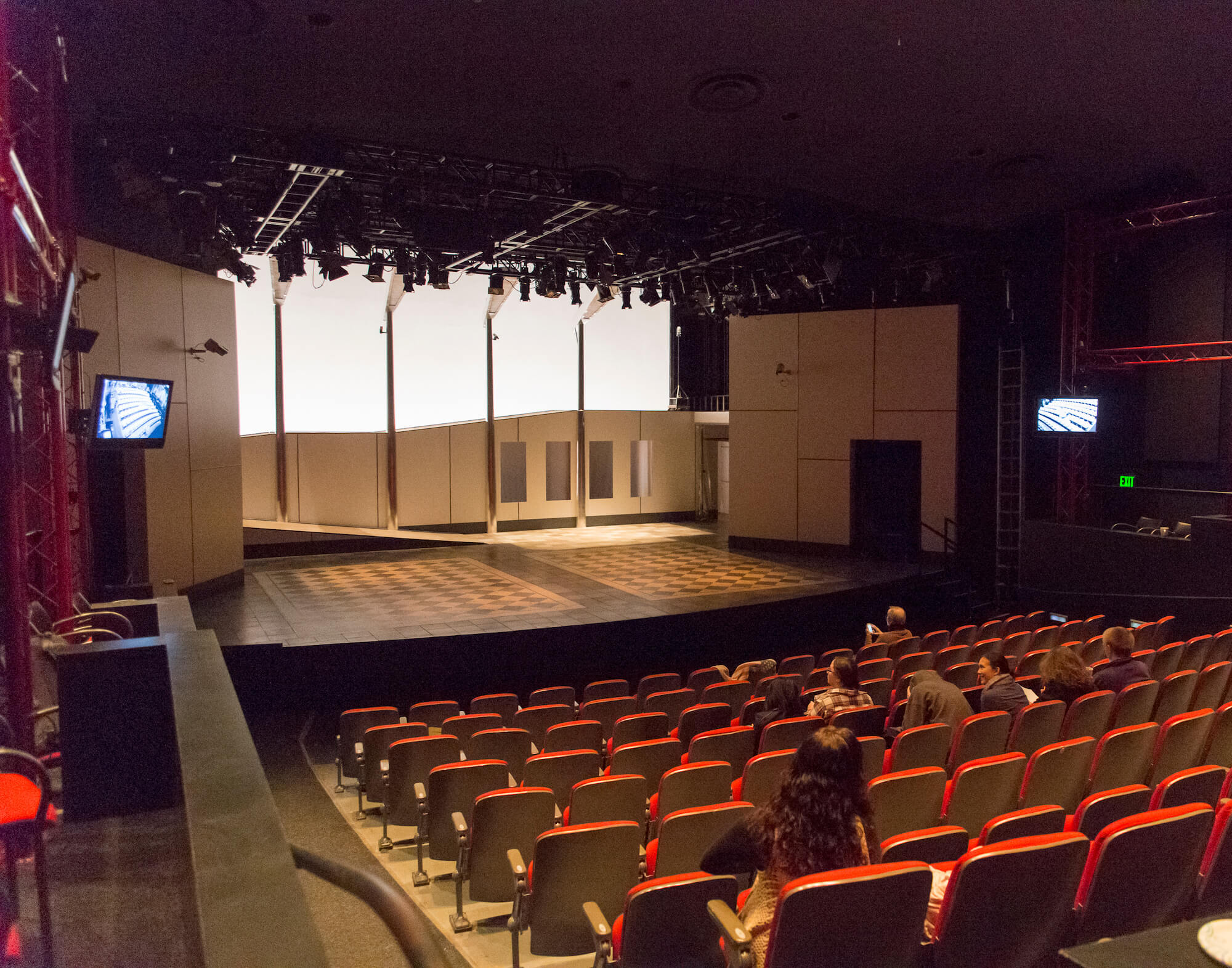
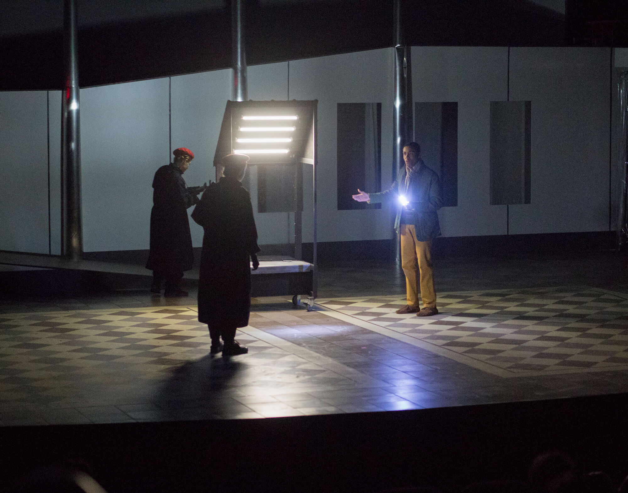
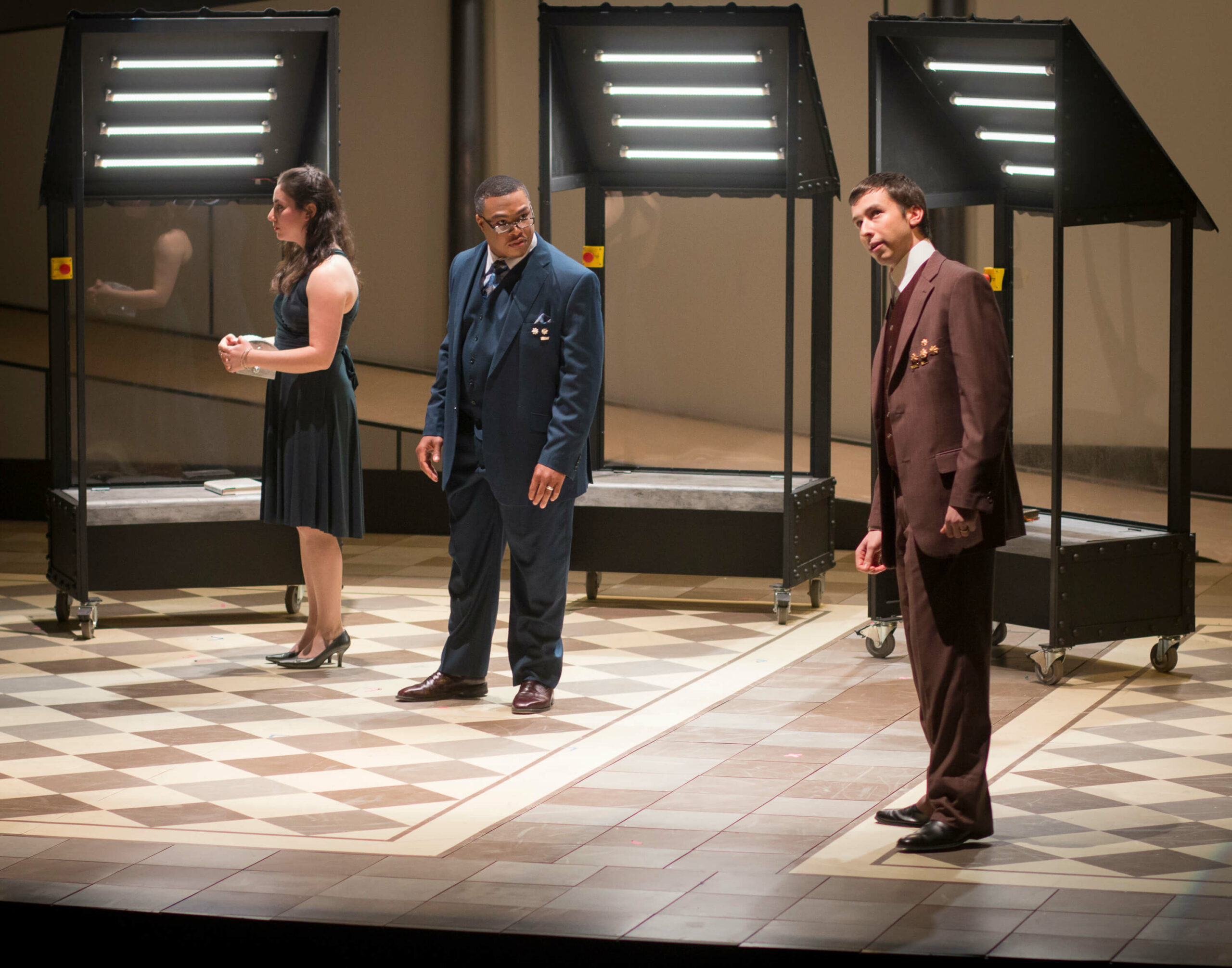
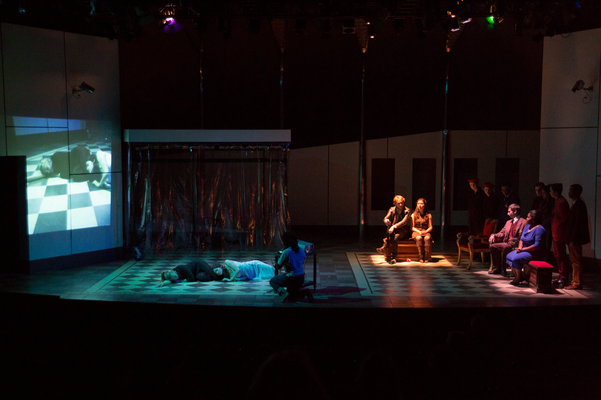
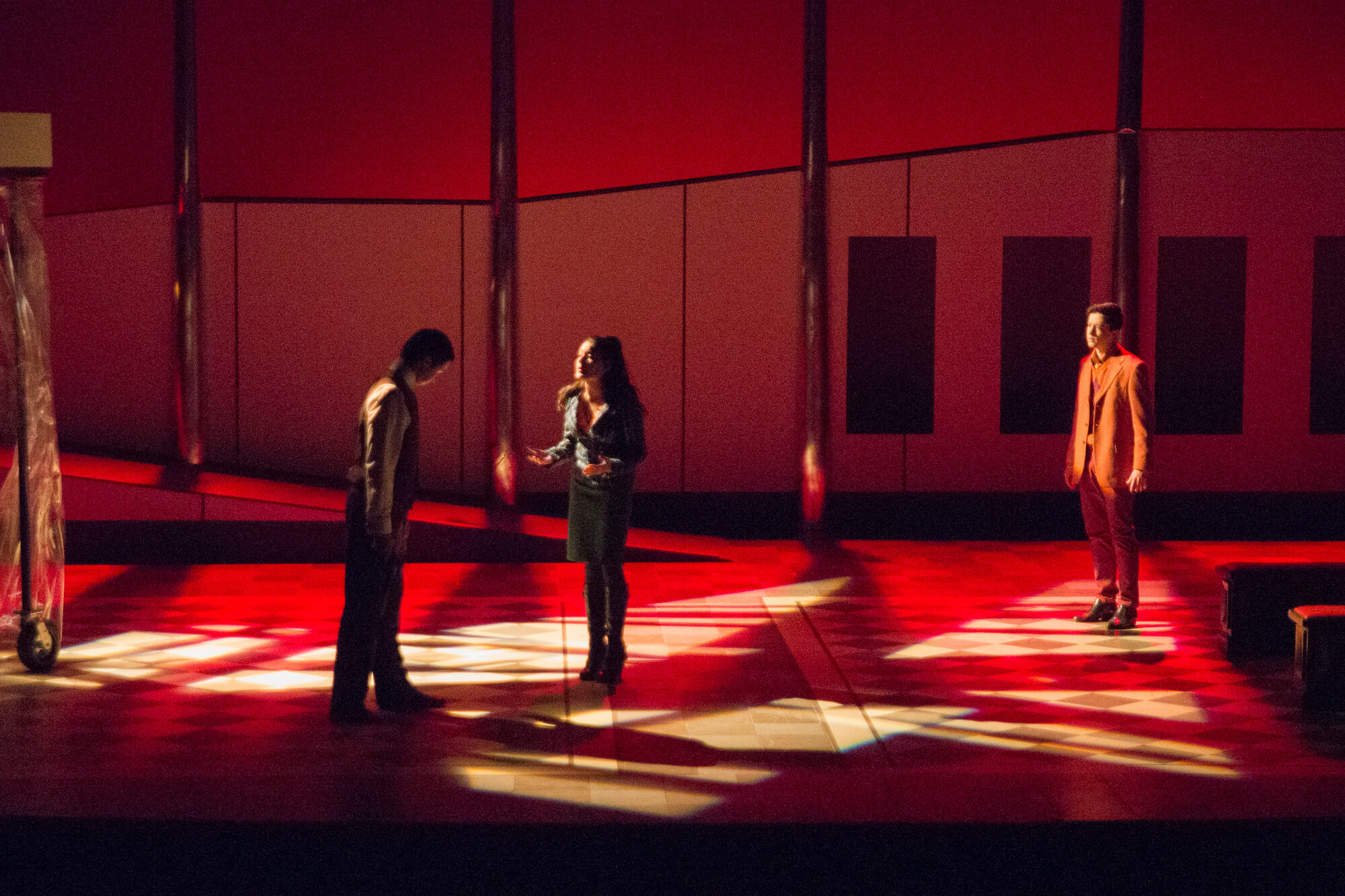
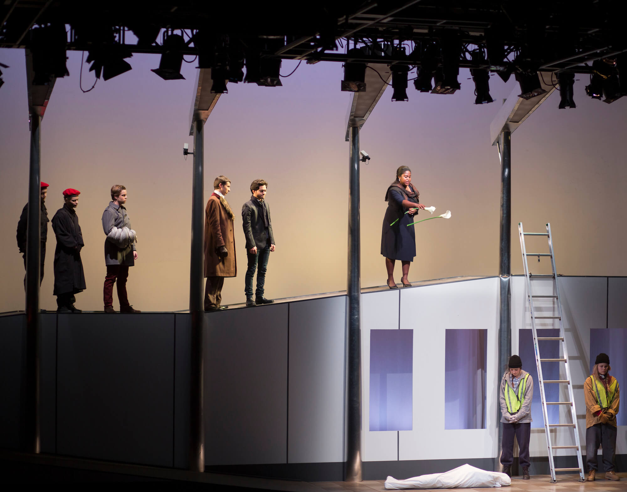
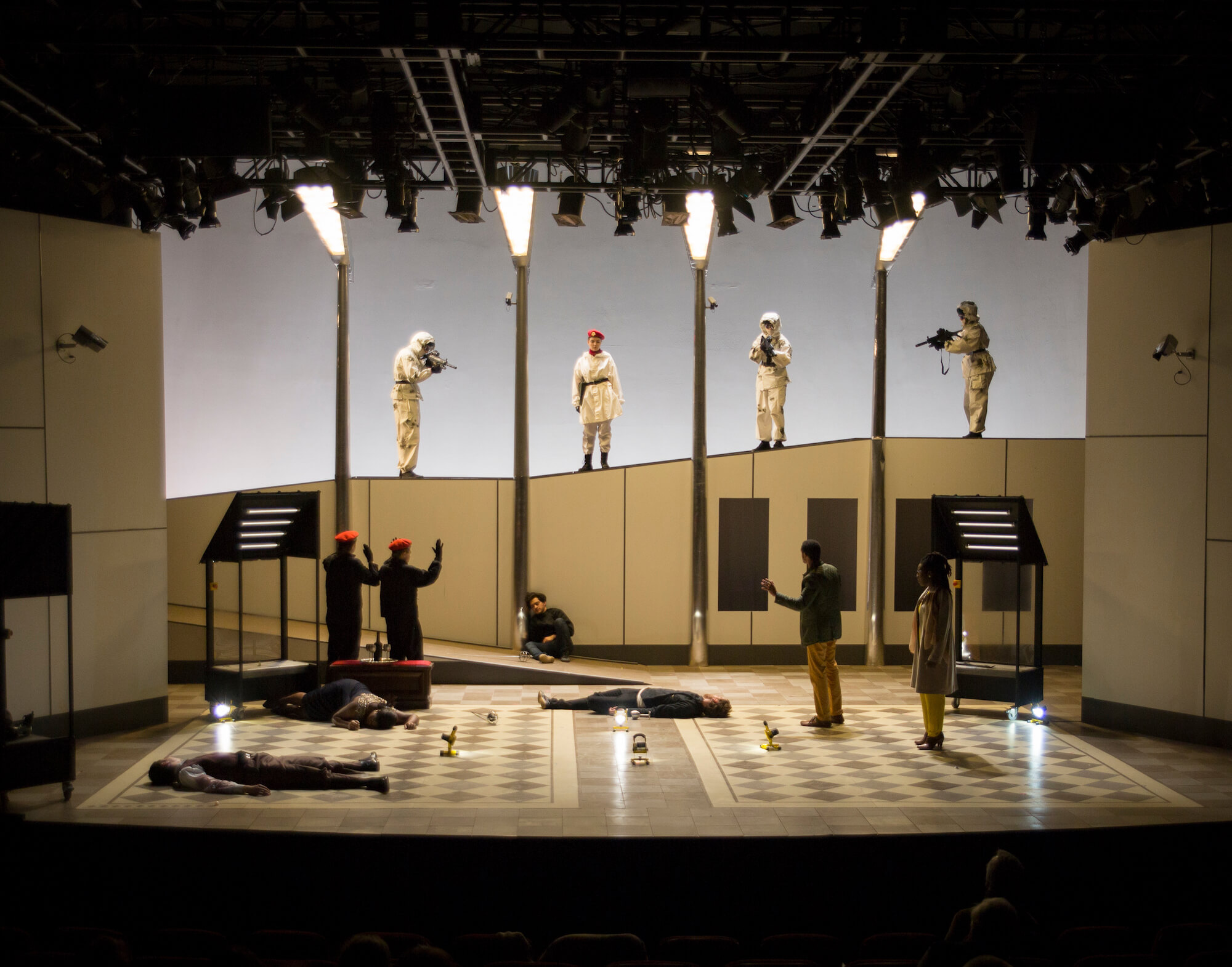
Subsequent photos from the final production show the light-up set pieces, the avant garde performance art-styled play-within-a-play, the “emergency lighting” state of Act IV, and Ophelia’s grave and the final fatal duel in Act V.
Reflections on project
I didn't encounter the double diamond or other mainstays of Design Thinking™ until I had been a practicing professional designer for almost 20 years. I remember being surprised at how much my own design process mirrored this articulation, further cementing my belief that designers are designers are designers—we just have different vocabularies for things based on the field or industry in which we find ourselves. (Full disclosure: I did read Don Norman’s The Design of Everyday Things very early in my design career, and consider it to be one of my creative bibles, along with Berger’s Ways of Seeing, Lyndon & Moore’s Chambers for a Memory Palace, and Huizinga’s Homo Ludens.)
The thing that I love about theater, and what makes it so distinct from film and television, is that theater always exists here and now. It doesn't matter how long ago it was written, the play is always happening right now, in this place. My design for this production of Hamlet grew out of an anxiety-fueled dinner conversation with my collaborators during which we saw all of our fears about the world we lived in reflected in this text written 400+ years earlier. From our initial statement of the problems we saw around us (the surveillance state, fear-driven decisions, the trading of freedoms for security, the psychological exhaustion of the 24-hour news cycle) I proceeded in a beautifully linear (but also intuitive and associative) manner through a process of designing a world in which Hamlet’s dilemma, and tragic end, could play out in a way that would be meaningful to the audiences of 2014.
Last pie baked:
Pear pie with an almond cake topping.
Of course it's gone now. Long gone.
©2024 David Gürçay-Morris
